Hey guys, Jana here,
There are several elements that go into play when a movie is prepping for their initial debut. There is an advertising campaign, and the goal is to saturate the atmosphere with the upcoming movie, all designed to get us to show up in theaters and plunk down a chunk of our hard-earned cash. One of the first type of media to invade our subconscious is the all-important movie poster. This may seem like a small thing, but each poster is carefully designed to share just enough information that will reel us a bit closer, then just like when fishing, set that hook.
There are dozens of ways this can be done, really understated and more mysterious or just spelling it all out, in some cases, literally. I worked at a video rental store in high school and my favorite thing was tagging the posters that came in as “mine” before they went up around the store. Sometimes I had to wait a few weeks, but then those posters would be covering every available inch of real estate in my room, including the ceiling. So take a look at some of my favorite posters and tell me what yours are.
These are in no particular order and I love them all for different reasons.
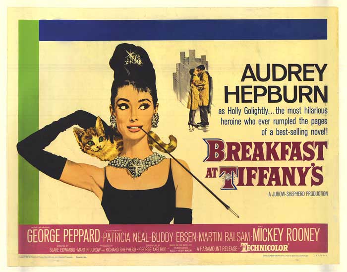
‘Breakfast At Tiffany’s‘ – The quintessential Audrey Hepburn in her bejeweled glory, you can see there’s a love story element, but you can also see it doesn’t take itself too seriously, plus you can practically feel how thick the paper it’s printed on is.
‘Ghostbusters‘ – We all had big questions when we saw this poster outside theaters in the 80’s, what’s on their backs and what are they fighting? I also began using the genius but simple “no ghost” cartoon on every notebook and folder I owned.
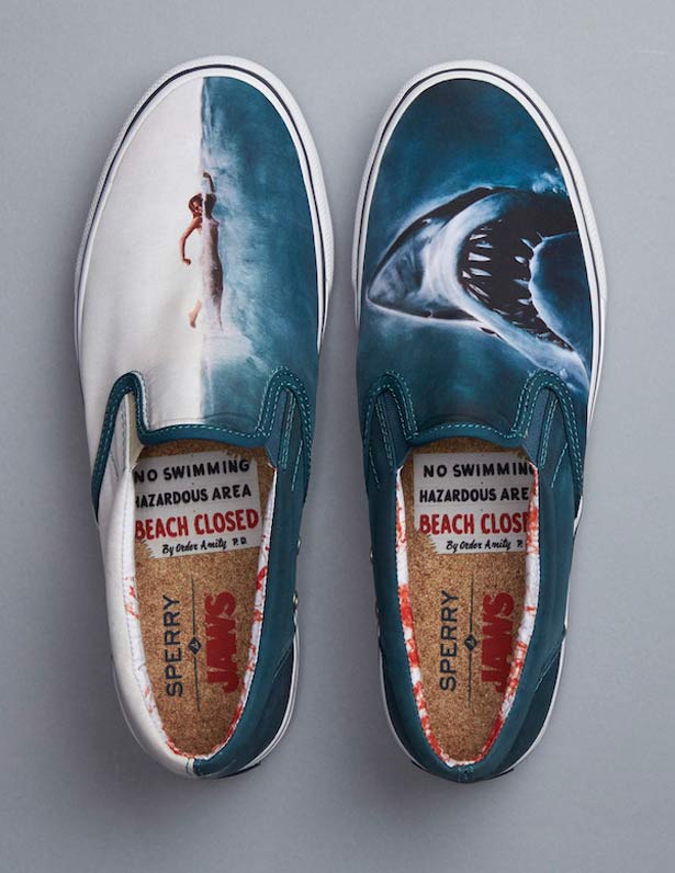
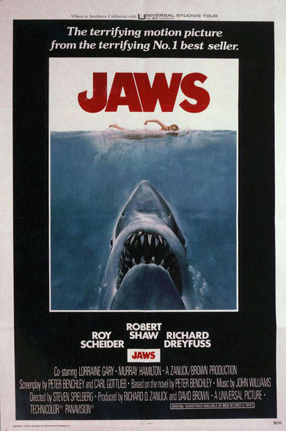
‘Jaws‘ – I love this poster so much, I have shoes that match it. No really, I do. This is one of my favorite movies of all time and the beginning of my total infatuation with sharks. You knew what was going to happen but you can’t warn that poor swimmer. You can’t get more iconic than a perfectly executed Spielberg poster.
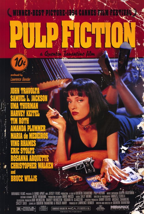
‘Pulp Fiction‘ – The poster for this Quentin Tarantino juggernaut looks like you just pulled it from a used book store shelf. You see the damaged but dangerous leading lady nonchalantly interrupted from reading her own book of pulpy goodness. The noir feeling is palpable in such a way you can almost smell the smoke from her cigarette.
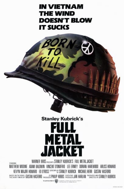
‘Full Metal Jacket‘ – What’s a list of memorable posters without a Kubrick submission? The poster gives us the truly crossed feelings the lead, Joker, has through the film. The juxtaposition of the peace sign next to a “Born to Kill” motto makes one hell of a lasting impression on a person.
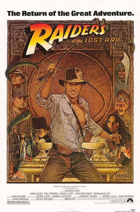
‘Raiders of the Lost Ark‘ – This poster is really amazing in it’s hand-drawn awesomeness. It, like ‘Pulp Fiction‘, feels like a book that’s going to jump off the screen at you. The co-stars appear carved into the background while Indy stands out, front and center, ready to take them all on. The whole image looks like it’s in an interrupted state of motion and you just know the movie is going to be a roller-coaster of action.
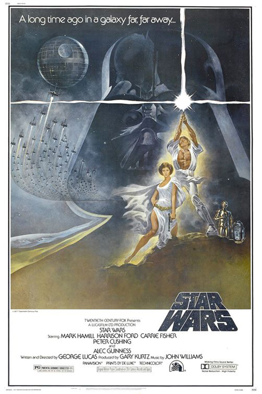
‘Star Wars‘ – I fell in love with the way we see Mark Hamill’s Luke holding the light saber that will battle the evil forces. It brought back every image of ‘He-Man‘ and Lion-O from ‘Thundercats‘ and you knew, this guy was going to save the day. We catch a first glimpse of Princess Leia and C-3PO and R2-D2 all overshadowed by the menacing Darth Vader. There’s no denying who’s the good guy and the bad guy in this poster. We had no way to know that the line of text on the poster was foreshadowing a lot more reading to come.
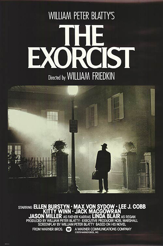
‘The Exorcist‘ – This poster always gave me a little bit of an edgy feeling. The fog, his being outside the house, and he’s back lit so it’s all just a gray-scale image. That wonderful sense of foreboding served us well because how could they have put the real terror on the poster for what went on inside that house? Brilliance.
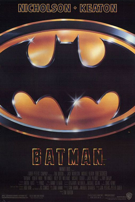
‘Batman‘ – At this point in 1989, our only source of a televised ‘Batman‘ was the 1966 Adam West TV series. We’d seen two movies from Tim Burton up to 1989, ‘Pee-Wee’s Big Adventure‘ and ‘Beetlejuice‘. None of us knew where his middle ground was as a director, yet. This poster did not give us any kind of ideas but we knew who the main players would be, and that was enough.
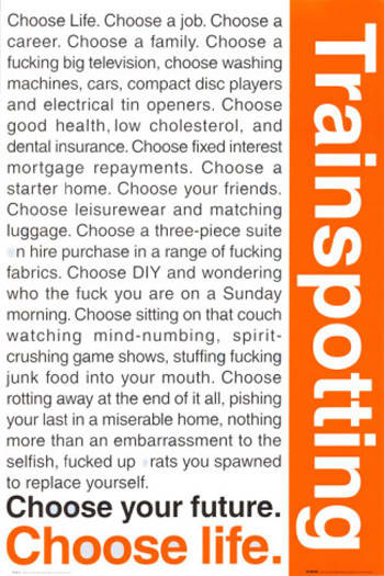
‘Trainspotting‘ – The opening lines are given to us, verbatim, on the poster. We wouldn’t read it in the somewhat hurried but passionate voice of Renton until after we’ve seen it, but it certainly set up the premise of the film, that life is a series of choices and one influences the next.
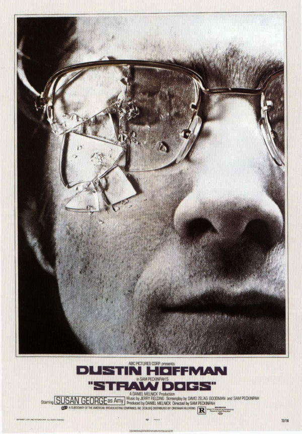
‘Straw Dogs‘ – This has to be one of my favorite posters just because of how the image seeps into your subconscious. Dustin Hoffman was pure brilliance in this movie, but he hated every second of making it because of the violence. He played a man that was a pacifist in most ways, he gets bullied, and taken advantage of repeatedly until he takes a stand. Once that happens, something inside him breaks and violence is the only way to end it. The image of a stoic Hoffman that has gone way past his breaking point speaks volumes.
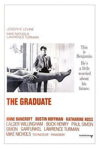
‘The Graduate‘ – Might as well follow with another Dustin Hoffman movie. The poster shows us he’s being seduced, but we don’t know how he’s going to act on that. Anne Bancroft played the teasing Mrs. Robinson, a woman perfectly at ease with making Benjamin choose between herself and her daughter. The seduction is perfectly poised, and a woman putting on stockings will never be seen the same way again.
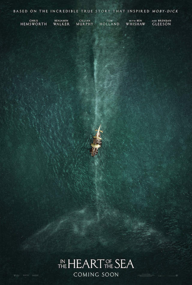
‘In The Heart of The Sea‘ – The sheer scope in size of the whale in relation to the boat on the surface gave me such anxiety when I first saw this poster. The words “Based on a true story” do not generally generate a lot of fear with me, but this time I was more than a little concerned how anyone could have survived this encounter to come back and tell the tale to anyone else.

